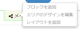
concrete5のエリアのレイアウトで5カラム(分割)にしたいなと思いまして。
いつもの「レイアウトを追加」をクリックし、Twitter Bootstrapよりカラムで5を選ぶことはできるんですけど、こちらだと3:2みたいな大きさになるんですよね。
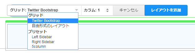
concrete5 バージョン7.5以降でレイアウトプリセットをテーマに追加できる
出力されたコードからcssをこねくり回してもよいのですが、今回は全てのカラムが均等幅になるようpage_theme.phpから5カラム用のプリセットを登録しました。
    public function getThemeAreaLayoutPresets()
    {
        $presets = [
            [
                'handle' => '5column',
                'name' => '5column',
                'container' => '<div class="row"></div>',
                'columns' => [
                    '<div class="col-sm-12 col-md-1-5 col-lg-1-5"></div>',
                    '<div class="col-sm-12 col-md-1-5 col-lg-1-5"></div>',
                    '<div class="col-sm-12 col-md-1-5 col-lg-1-5"></div>',
                    '<div class="col-sm-12 col-md-1-5 col-lg-1-5"></div>',
                    '<div class="col-sm-12 col-md-1-5 col-lg-1-5"></div>',
                ],
            ],
        ];

        return $presets;
    }
それからスタイルシートにも5カラム用のCSSを加えなければいけません。
.col-xs-1-5, .col-sm-1-5, .col-md-1-5, .col-lg-1-5,
.col-xs-2-5, .col-sm-2-5, .col-md-2-5, .col-lg-2-5,
.col-xs-3-5, .col-sm-3-5, .col-md-3-5, .col-lg-3-5,
.col-xs-4-5, .col-sm-4-5, .col-md-4-5, .col-lg-4-5 {
    position: relative;
    min-height: 1px;
    padding-right: 15px;
    padding-left: 15px;
}
.col-xs-1-5 {
    width: 20%;
    float: left;
}
.col-xs-2-5 {
    width: 40%;
    float: left;
}

.col-xs-3-5 {
    width: 60%;
    float: left;
}

.col-xs-4-5 {
    width: 80%;
    float: left;
}
@media (min-width: 768px) {
    .col-sm-1-5 {
        width: 20%;
        float: left;
    }
    .col-sm-2-5 {
        width: 40%;
        float: left;
    }
    .col-sm-3-5 {
        width: 60%;
        float: left;
    }
    .col-sm-4-5 {
        width: 80%;
        float: left;
    }
}
@media (min-width: 992px) {
    .col-md-1-5 {
        width: 20%;
        float: left;
    }
    .col-md-2-5 {
        width: 40%;
        float: left;
    }
    .col-md-3-5 {
        width: 60%;
        float: left;
    }
    .col-md-4-5 {
        width: 80%;
        float: left;
    }
}
@media (min-width: 1200px) {
    .col-lg-1-5 {
        width: 20%;
        float: left;
    }
    .col-lg-2-5 {
        width: 40%;
        float: left;
    }
    .col-lg-3-5 {
        width: 60%;
        float: left;
    }
    .col-lg-4-5 {
        width: 80%;
        float: left;
    }
}
結果
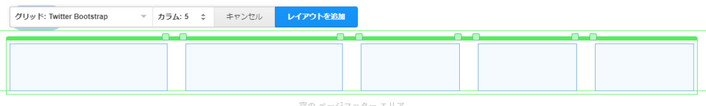
エリアの「レイアウトを追加」をクリックし、「グリッド:Twitter Bootstrap」を展開すると「プリセット」内に5columnが追加されています。
均等幅になりました。
複雑なレイアウトを使いまわしたい時などに便利かもしれません。